OVERSEA
Brand Identity
Note: This was a collaborative project completed with the team at Code Four Creative Agency
The Thinking:
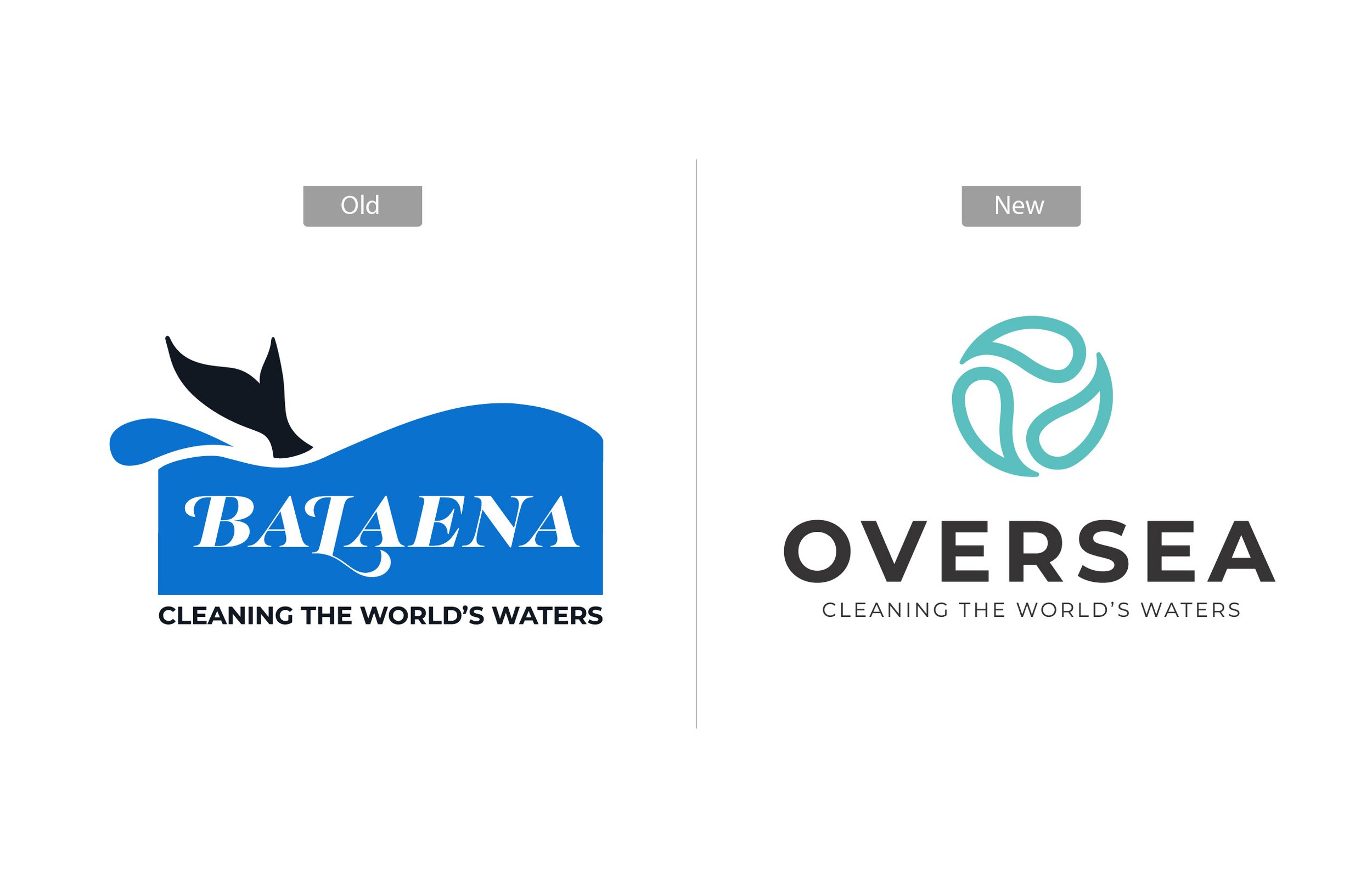
Oversea needed a modern, organic identity that captured movement, water, and clarity. Something fresh, welcoming, and rooted in the feeling of flow.
The Process:
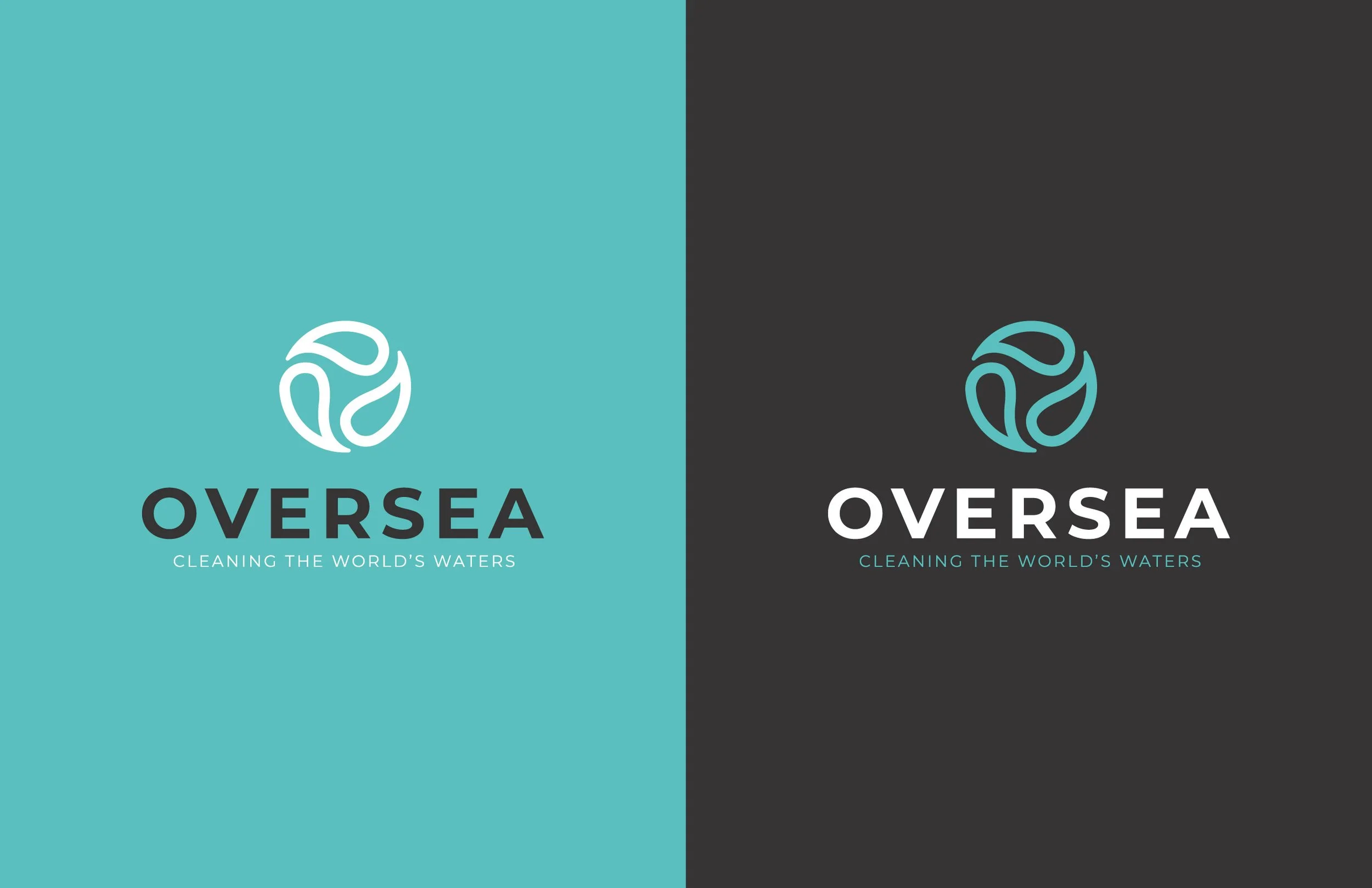
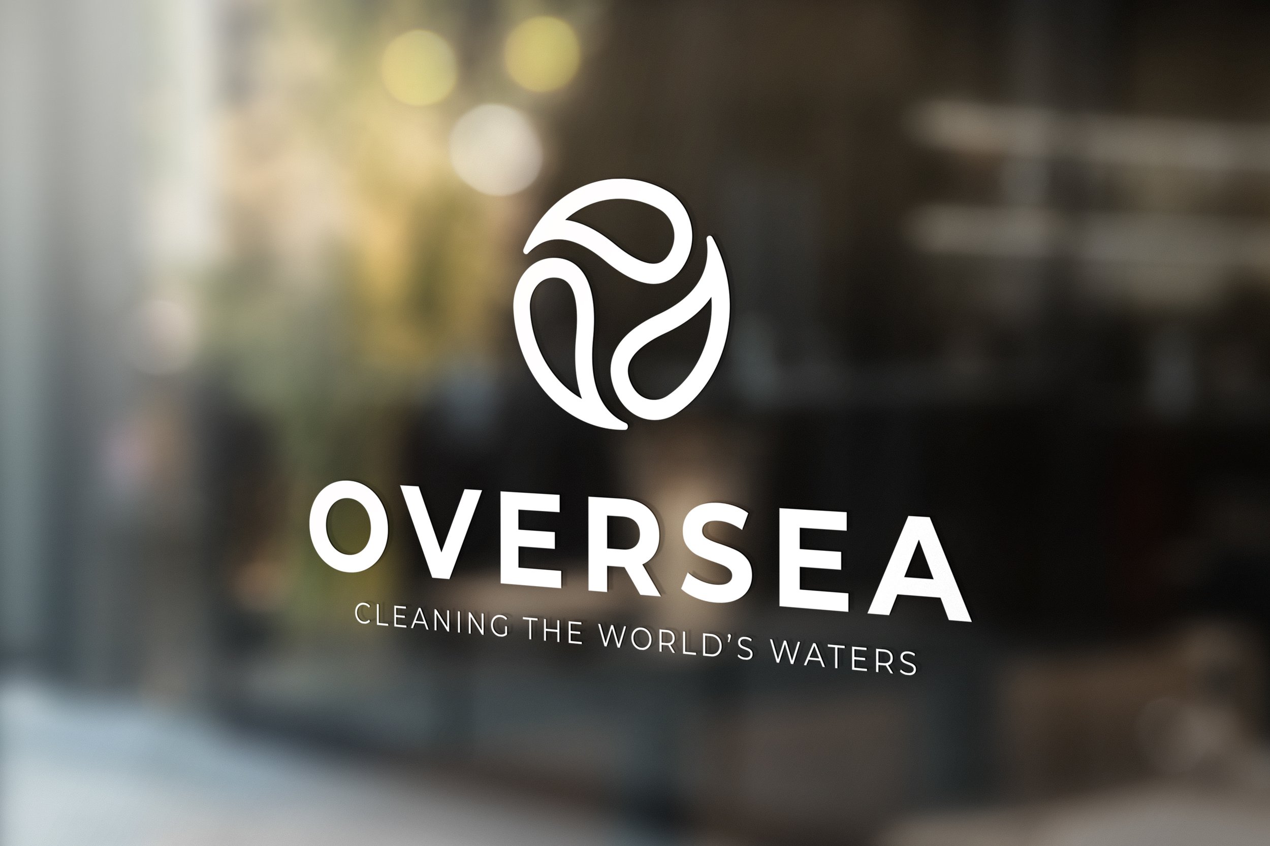
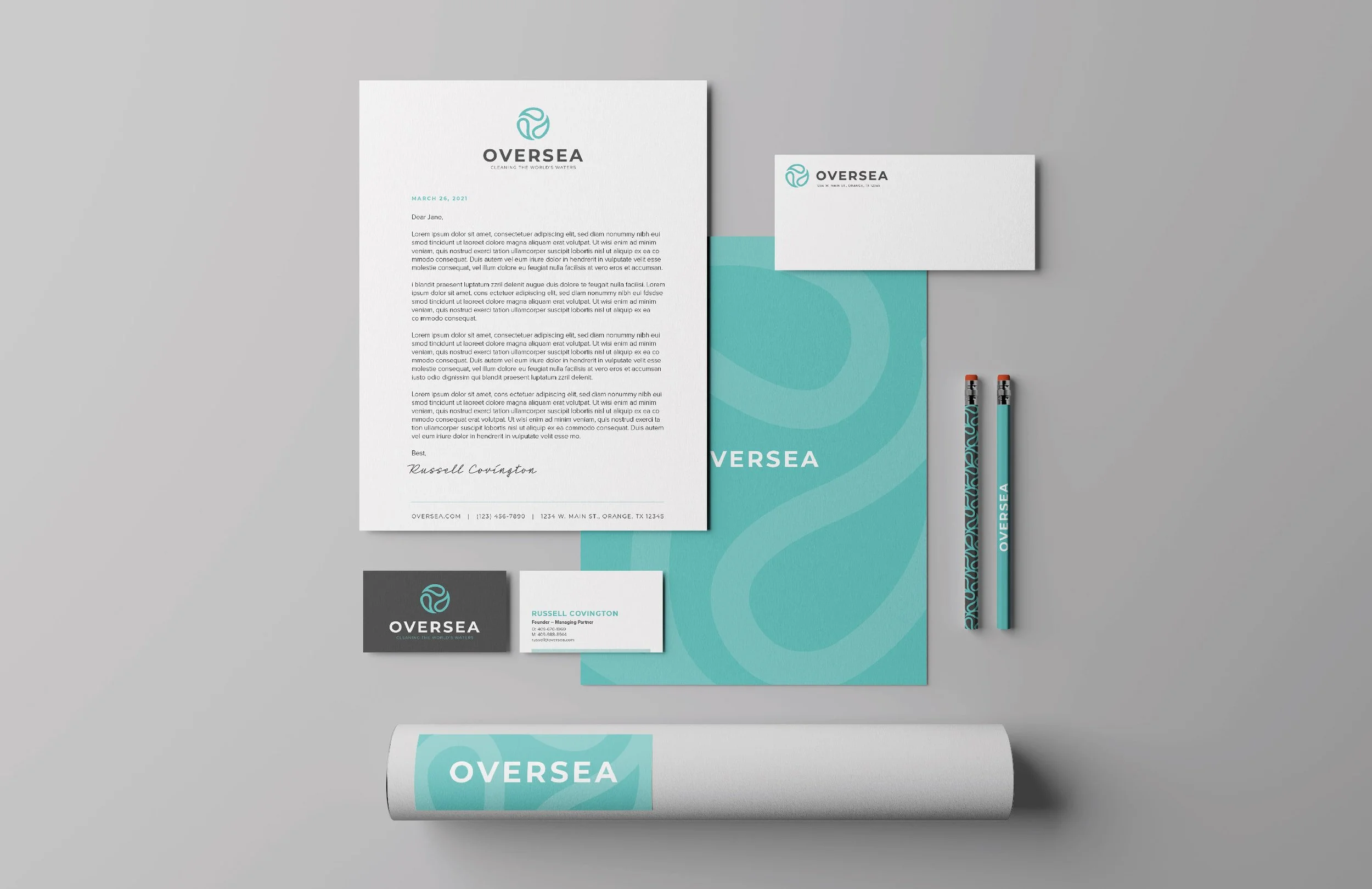
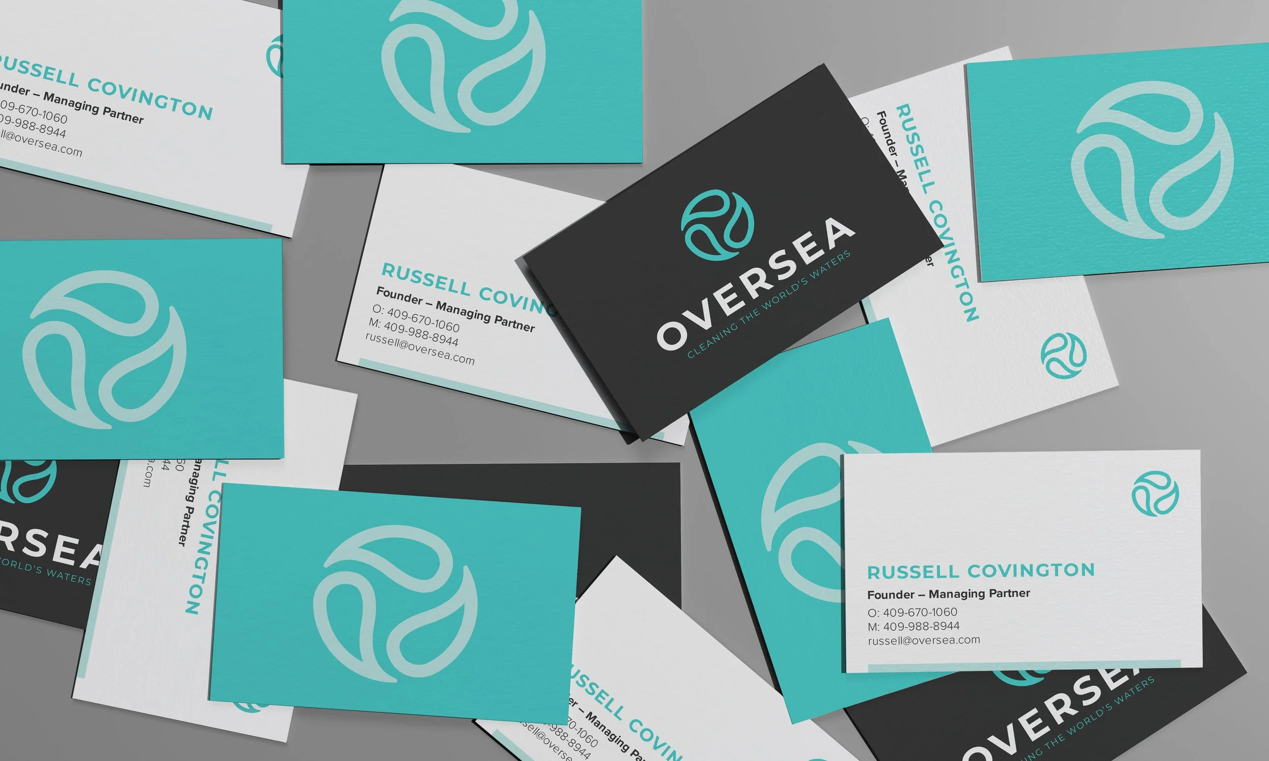
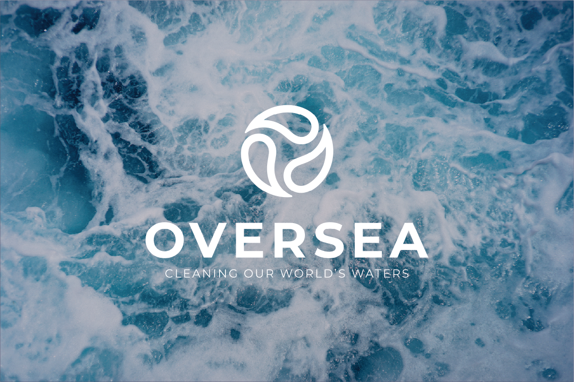
Explored abstract color palettes, sea-foam tones, and fluid forms. Developed an icon built from droplet shapes forming an “O,” paired with contemporary, easy-to-read typography.
The Results:
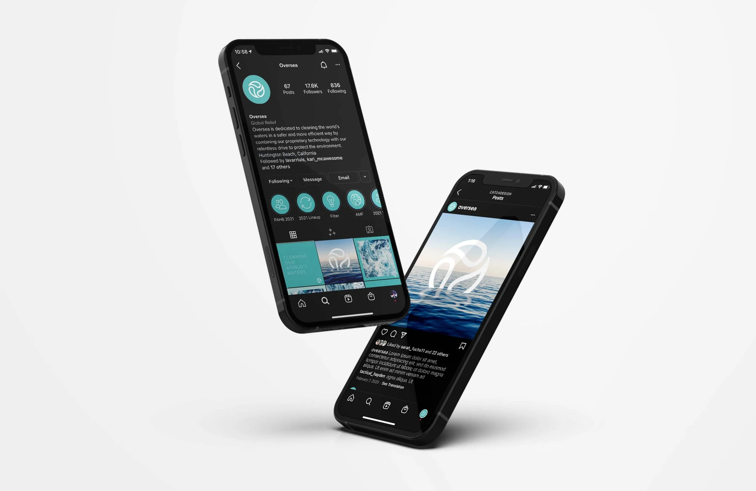
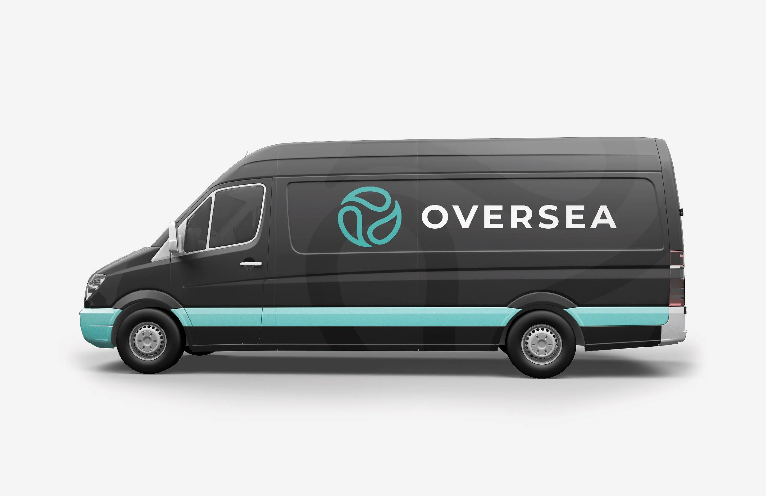
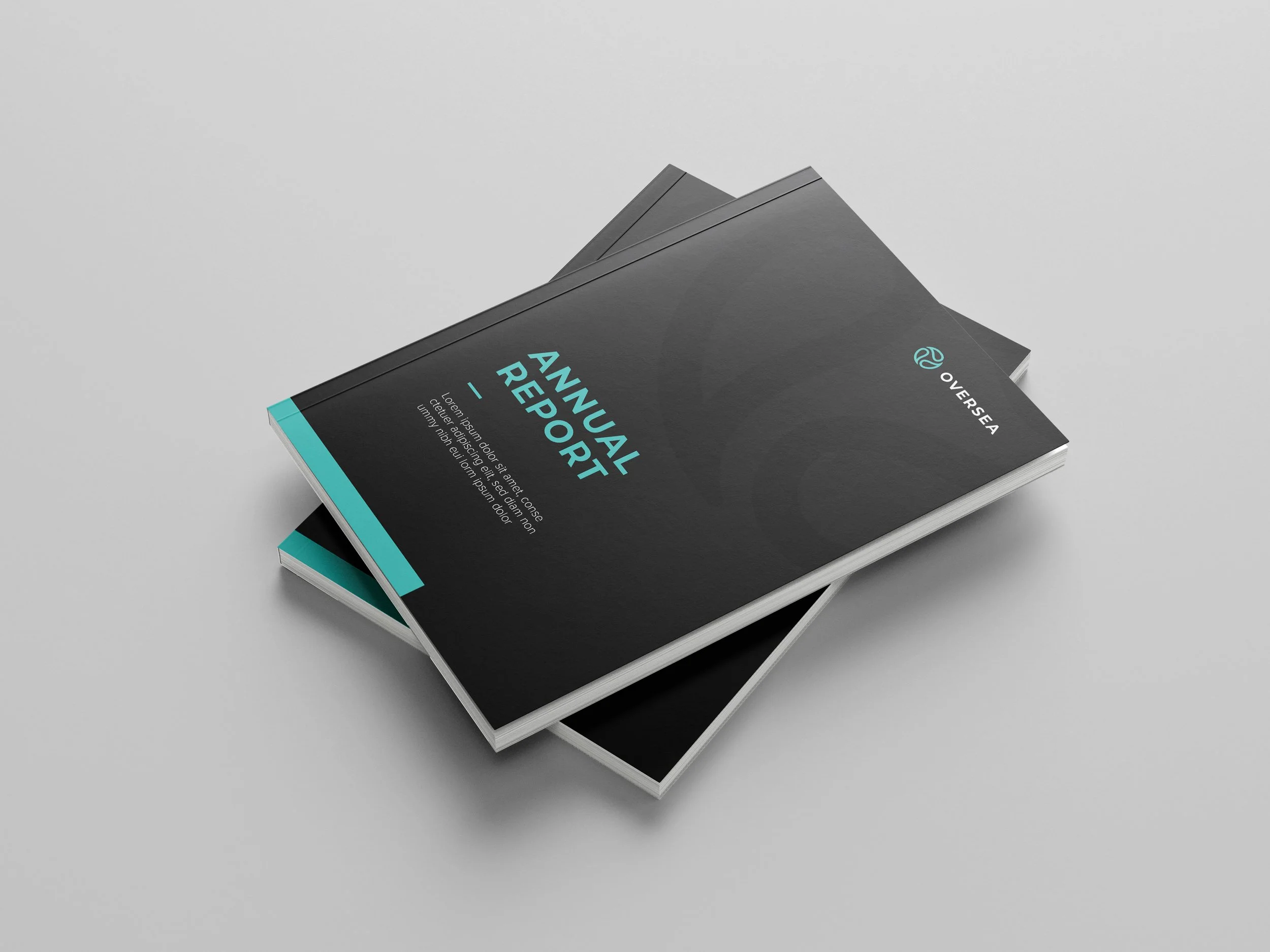
Delivered a free-flowing visual system with clean type, contrasting colors, and a signature momentum icon that gives Oversea a distinct, modern, and memorable brand presence.